Cook and the Pacific
Thylacine’s role
- interpretive design
- graphic design and exhibition branding
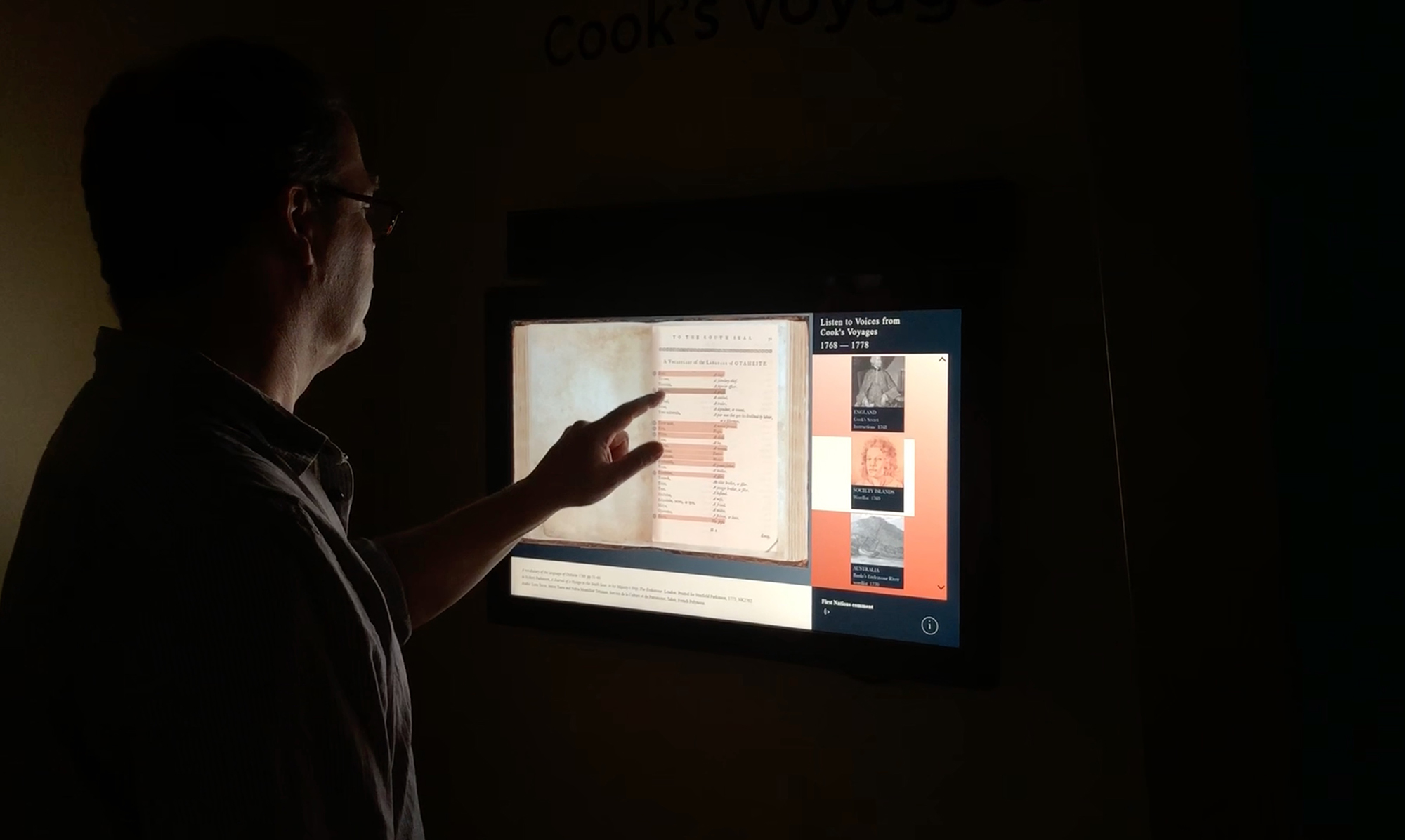
- media design, production and installation
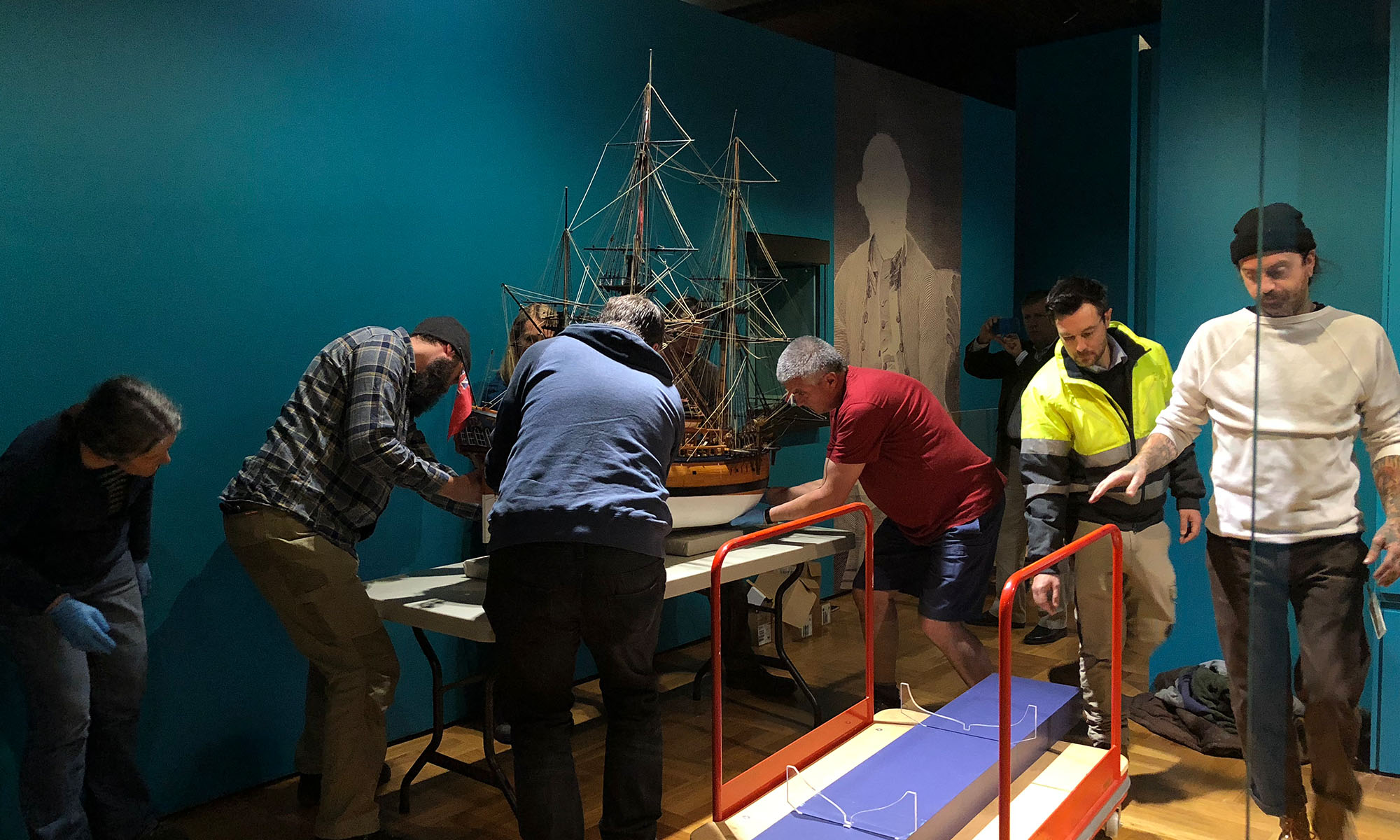
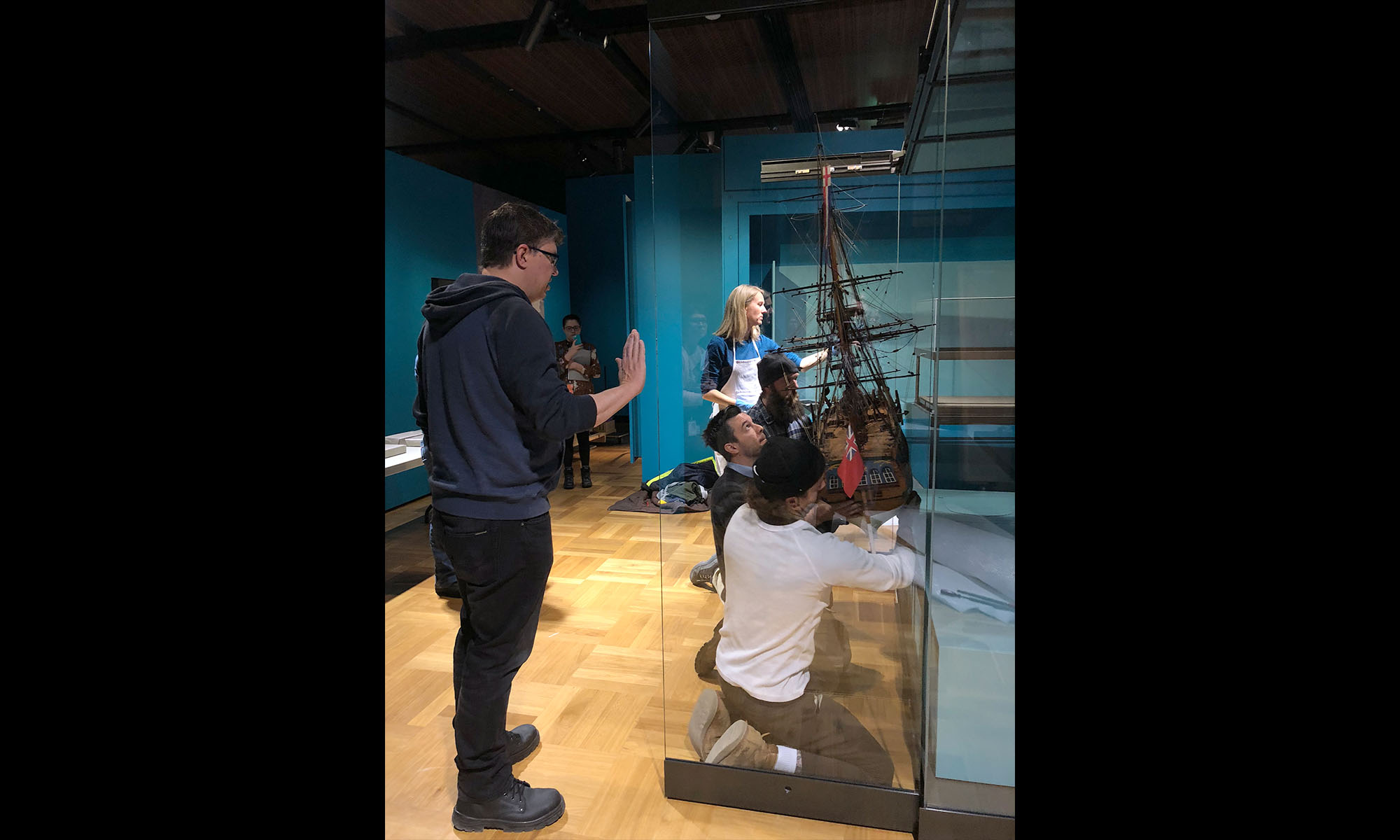
- fabrication, installation and de-installation of the exhibition
A Temporary Exhibition
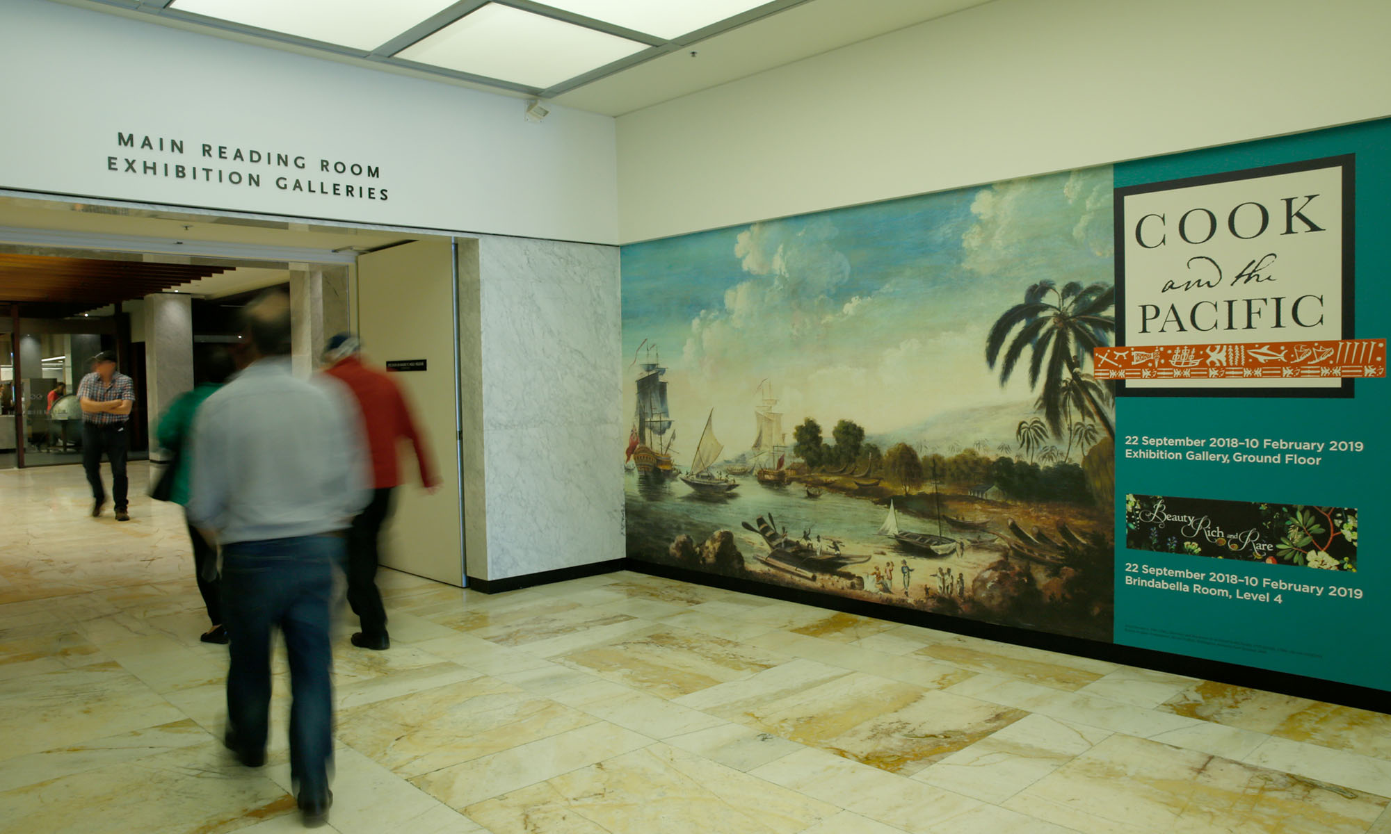
We recently designed Cook and the Pacific for the National Library of Australia to mark both the 50th anniversary of the NLA building and the 250th anniversary of the launch of Cook’s first Endeavour voyage from England in 1768.
The exhibition brought together the rich collection of material held by the National Library of Australia together with significant international collections relating to Cook, his life and his voyages in a major exhibition in 2018, the 250th anniversary of the departure of HMB Endeavour from Plymouth, England, in 1768.
Incorporating opportunities for First Nation voices within the design was an important aspect of the exhibition. The exhibition provided an opportunity for debate and differing perspectives surrounding Cook’s complex legacy for all Australians and people of the Pacific.
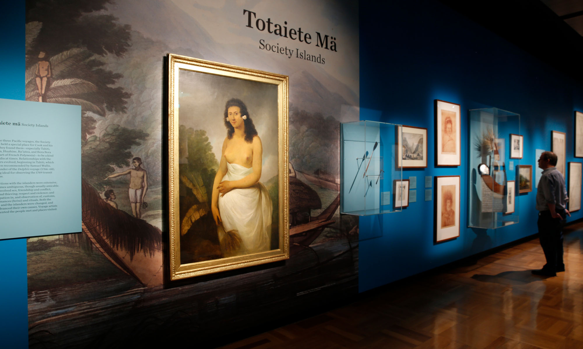
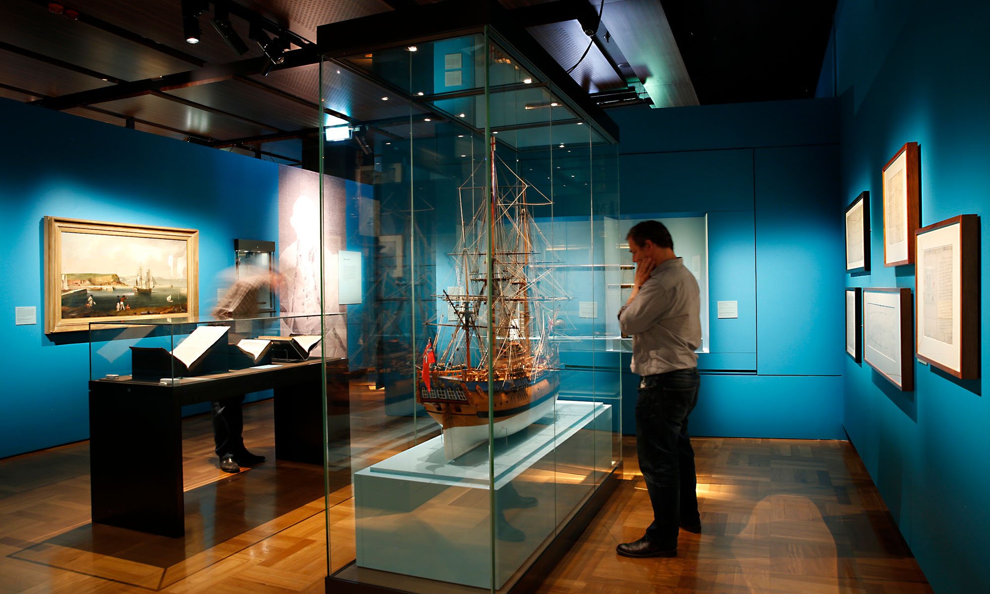
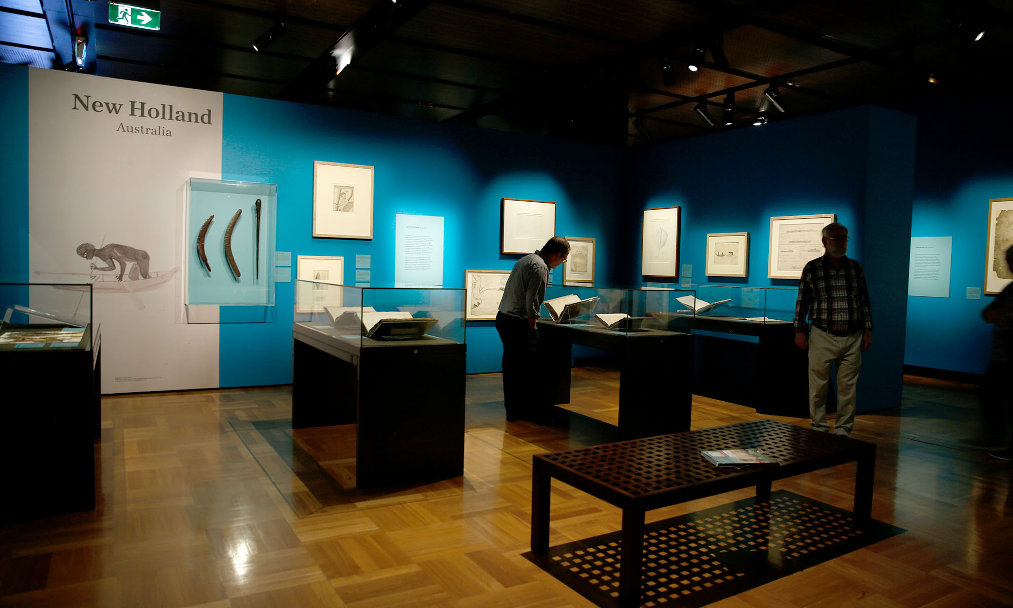
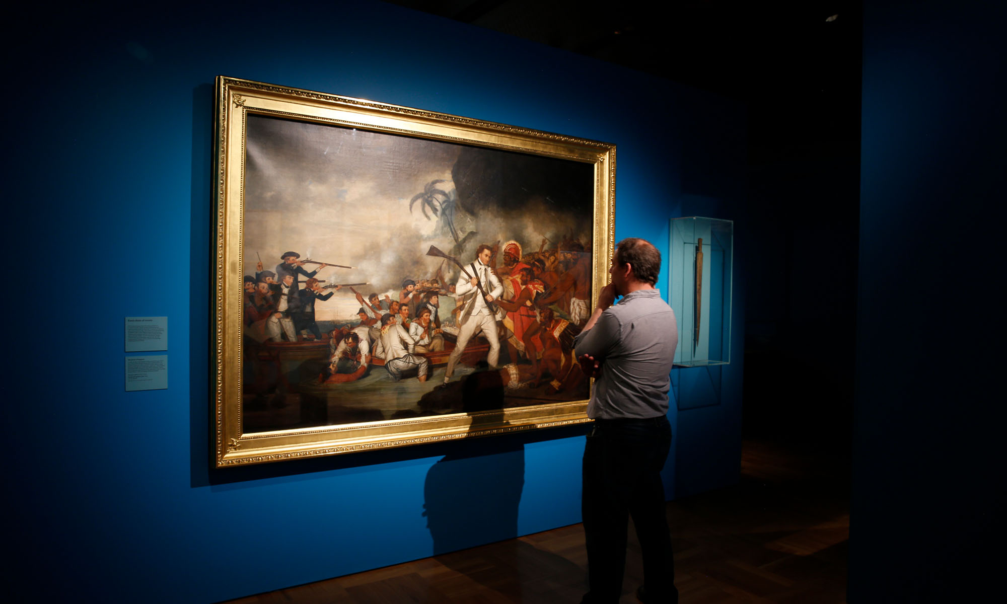
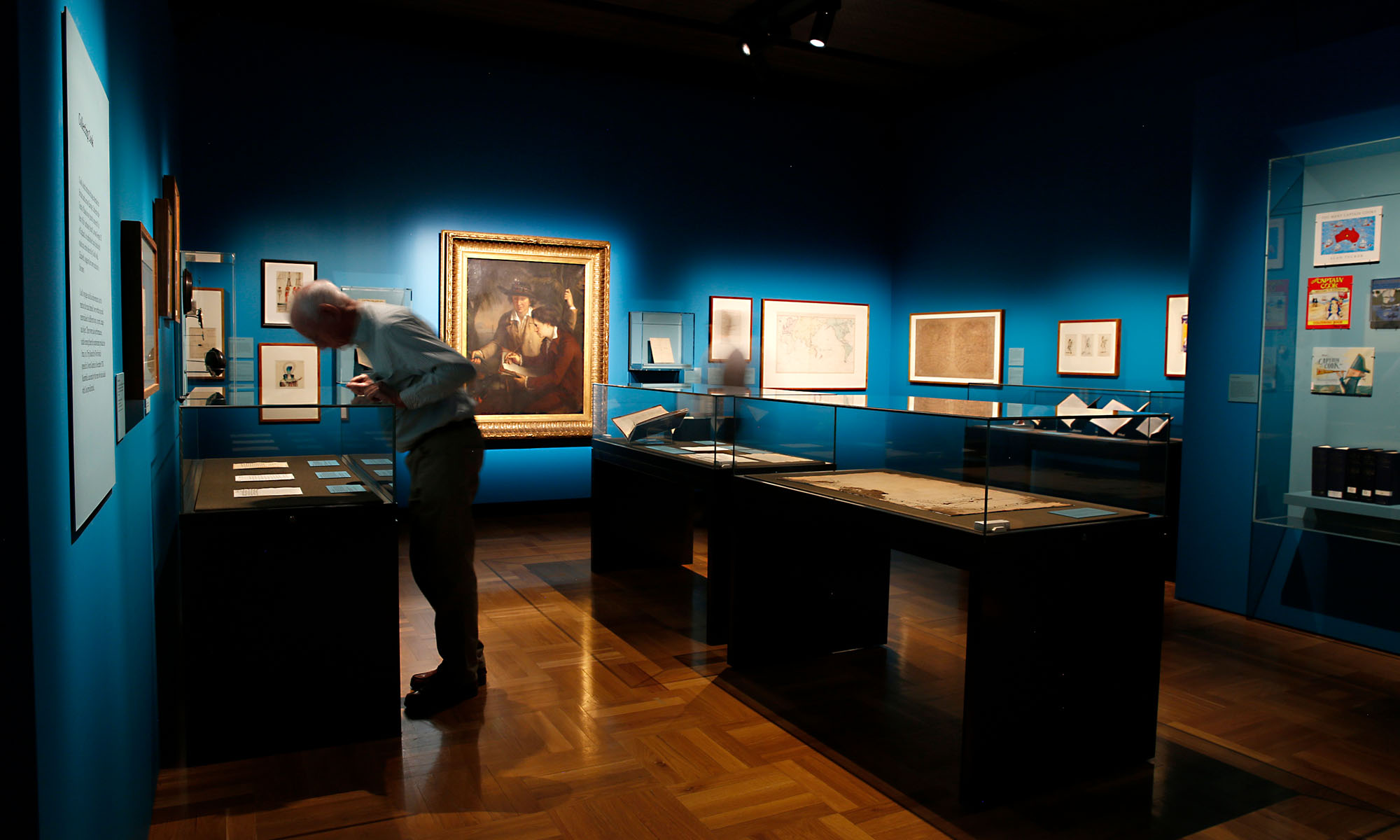
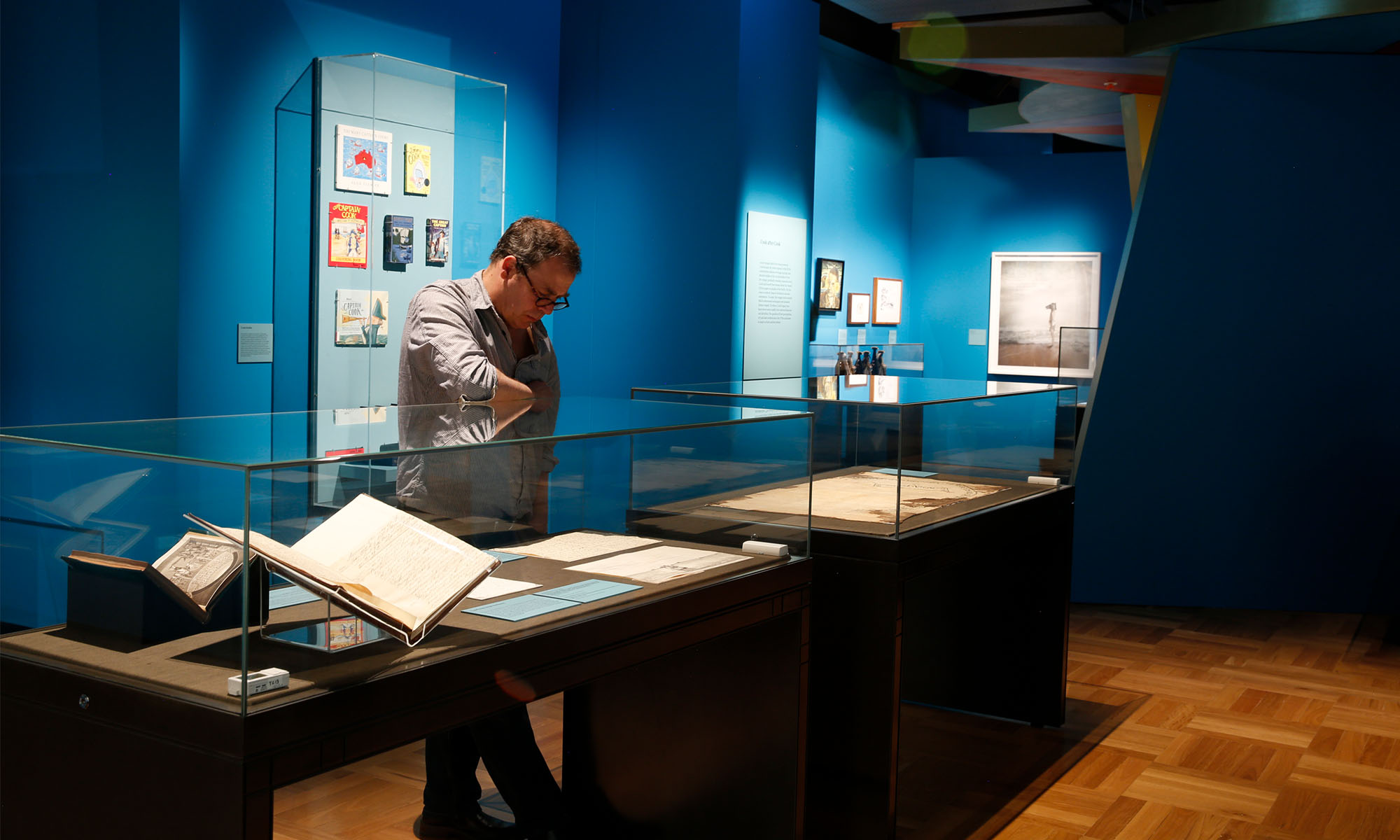
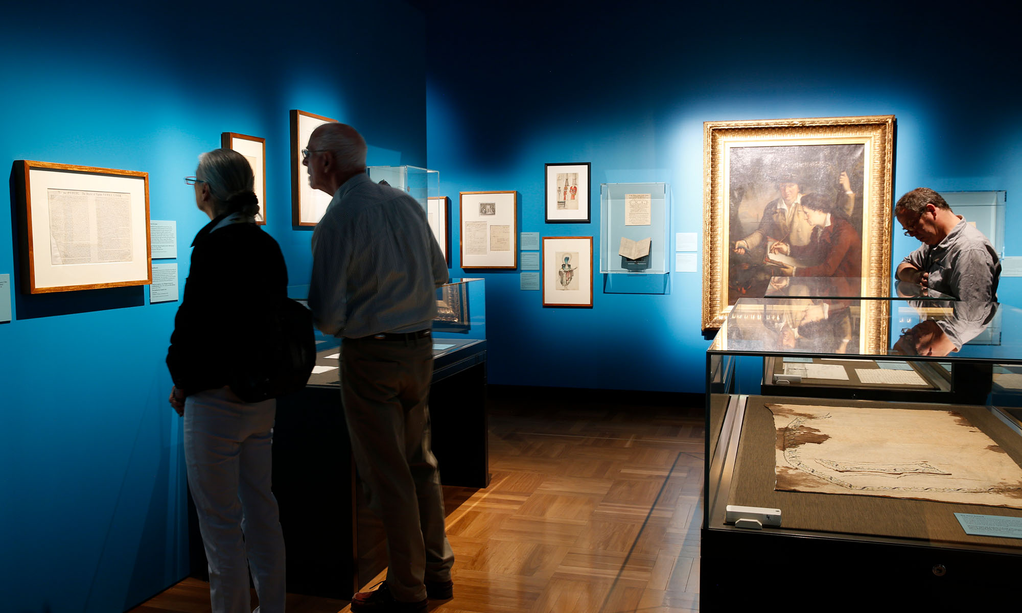
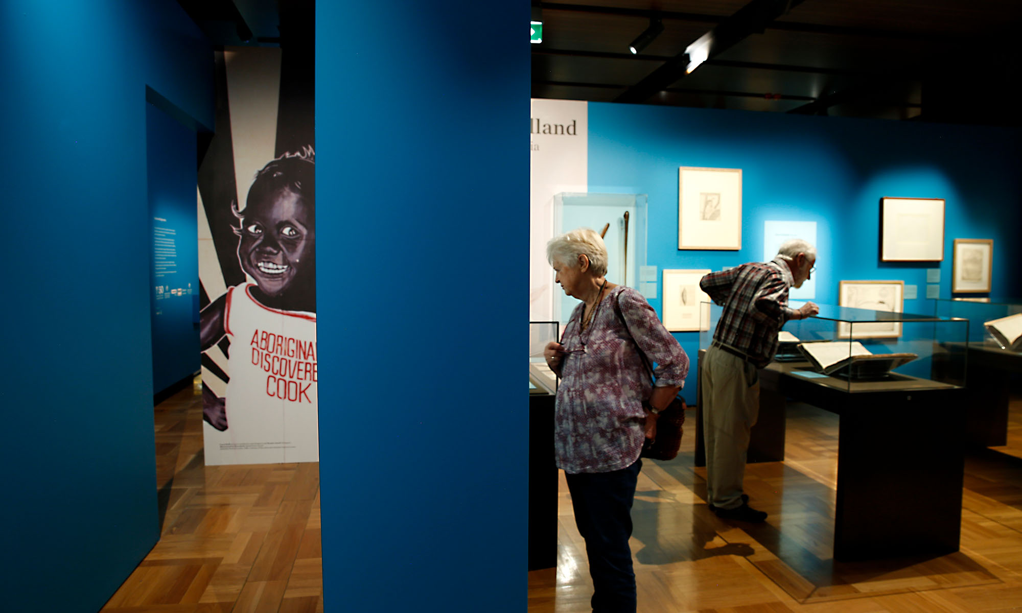
There are approximately 190 artefacts on display in the temporary exhibition gallery at the National Library of Australia. This gallery is quite compressed at 300sqm, and the design style attempted to resolve the need to layout many objects in a small heritage gallery through a number of devices including a “salon” style hang. This style evokes a strong sense of the 18th Century where collecting and display on mass was a common practice.
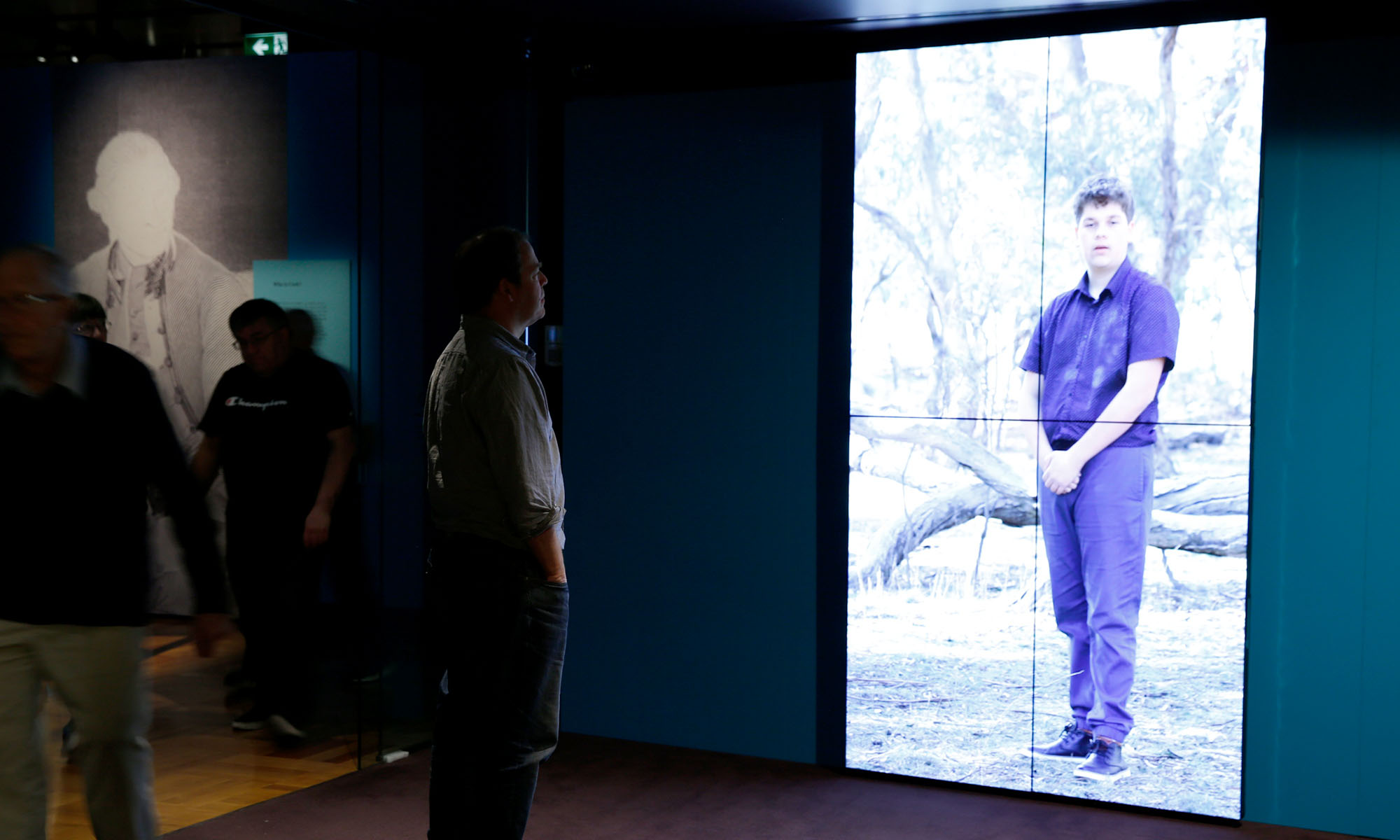
The exhibition design gives the visitor a new way of seeing the chronology and history of this fascinating time of exploration by acknowledging the Australian and Pacific communities that Cook had contact with on his voyages through two unique digital welcomes.
The two main local tribal groups in Canberra voice a “Welcome to Country” that is then followed by video portraits of different communities both within Australia and around the Pacific. This framed the exhibition by continuing to acknowledge Indigenous peoples and place through portraits, language and custom.
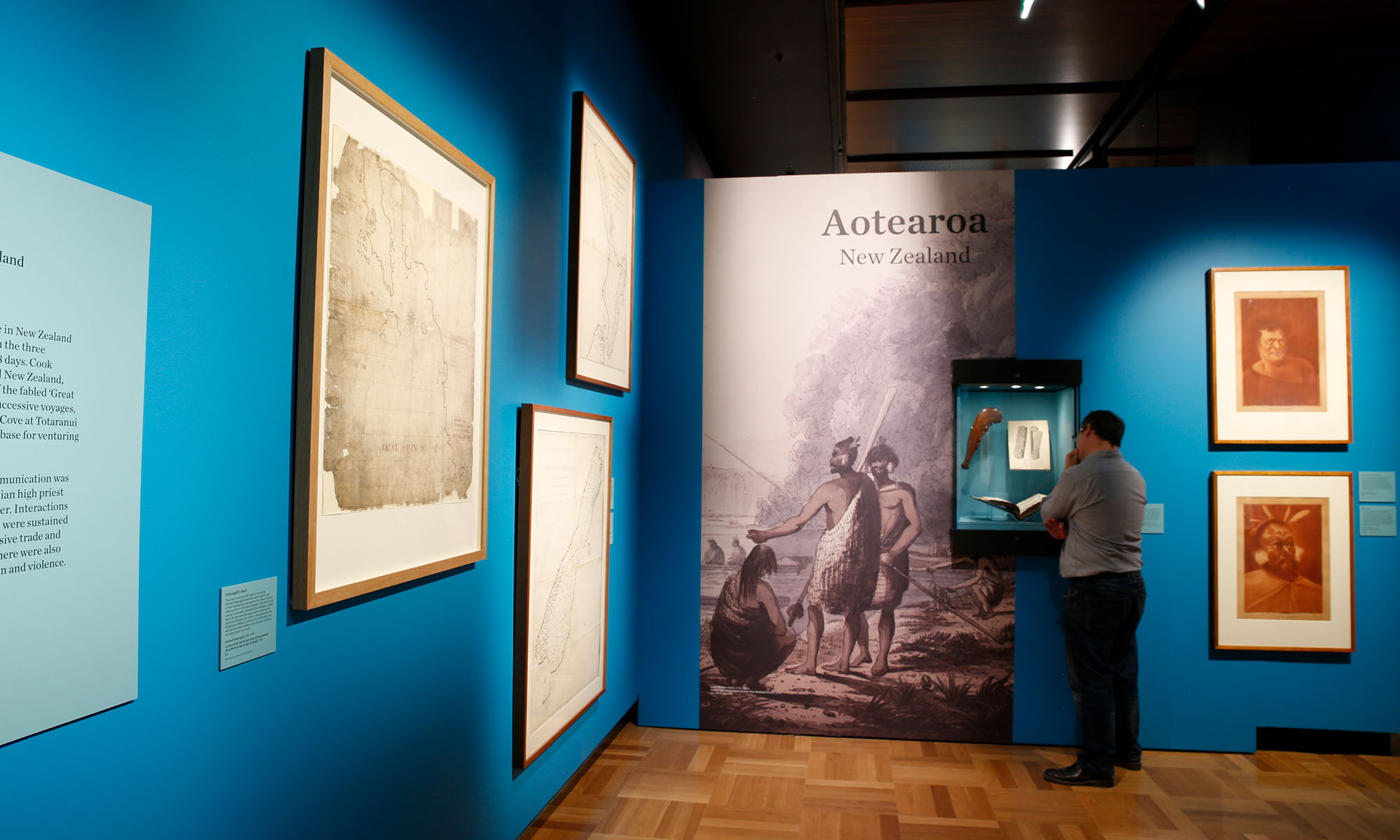
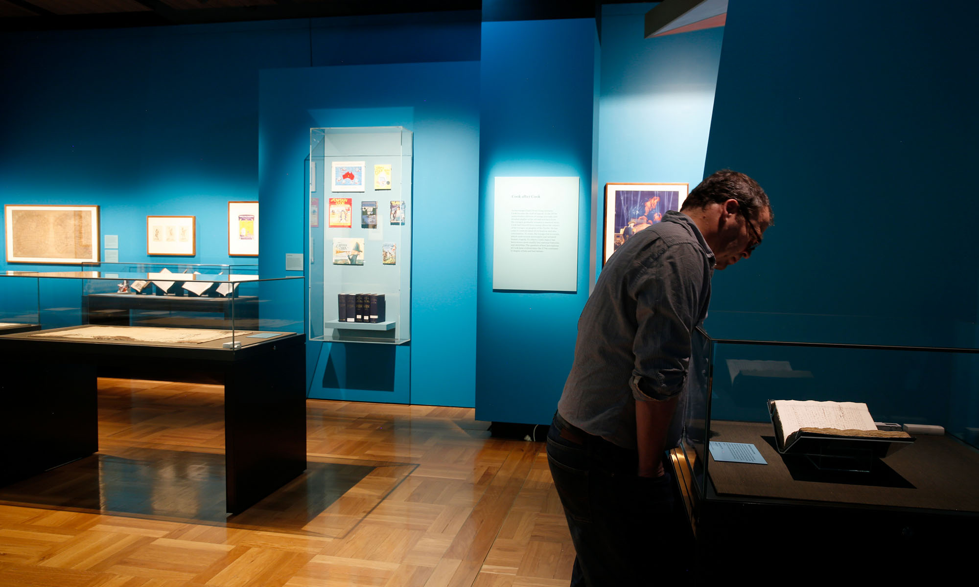
Following on from the “salon” style, the design endeavored to reflect the narrative through a number of additional devices. Large mural graphics, taken from historical images, were used as thematic dividers that evoke a sense of place. Within each of these graphics a display case with artefacts belonging to that place is set into the wall graphic.
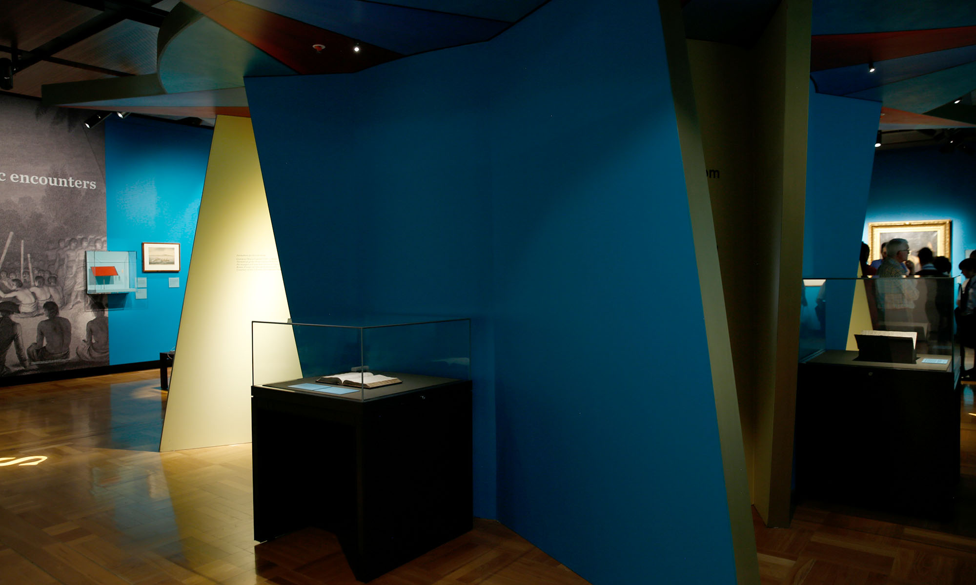
The use of a strong pacific blue colour for select walls and flats referenced the ocean which was the medium connecting Europeans and peoples of the Pacific. The colour was used carefully so as not to overpower the exhibition content.
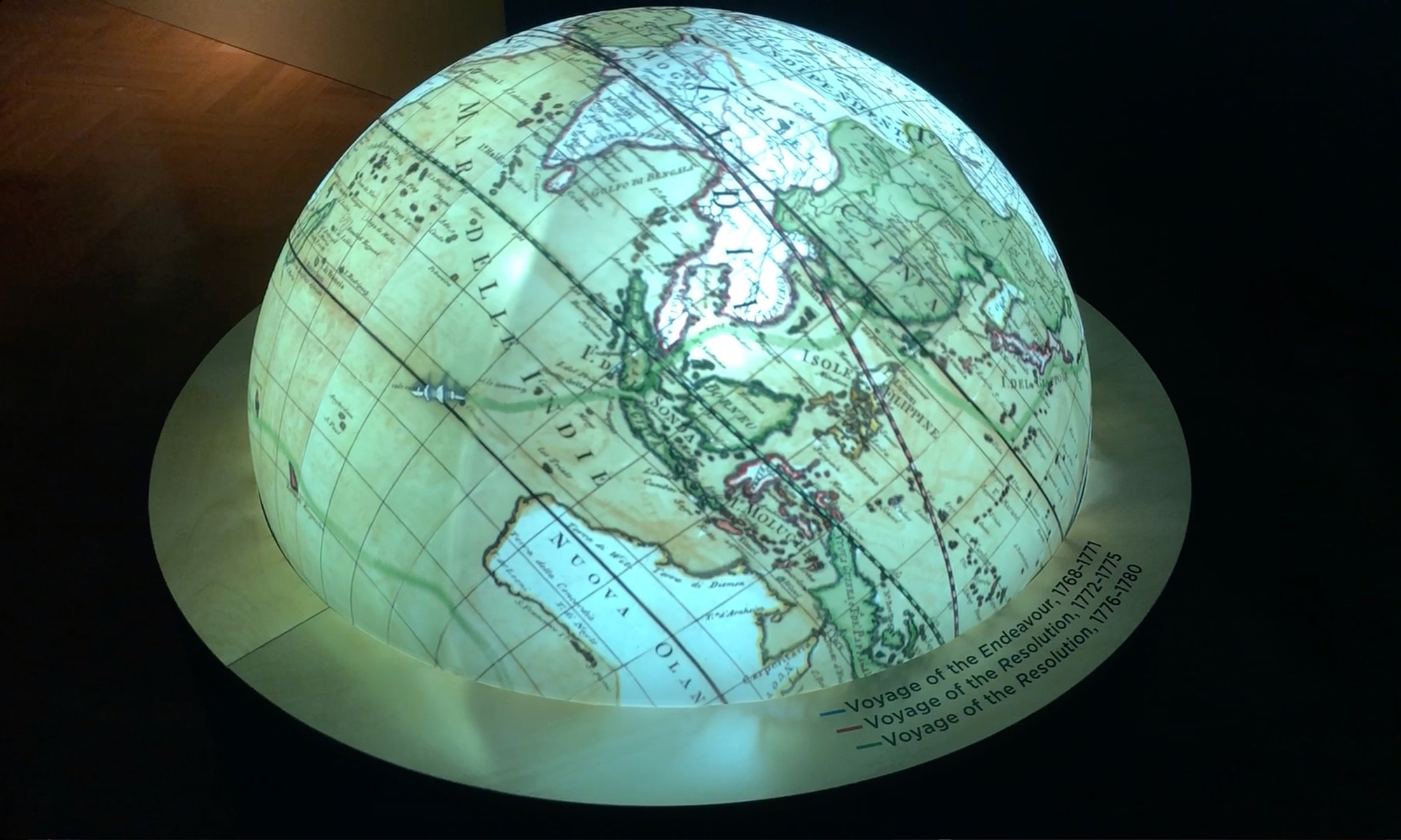
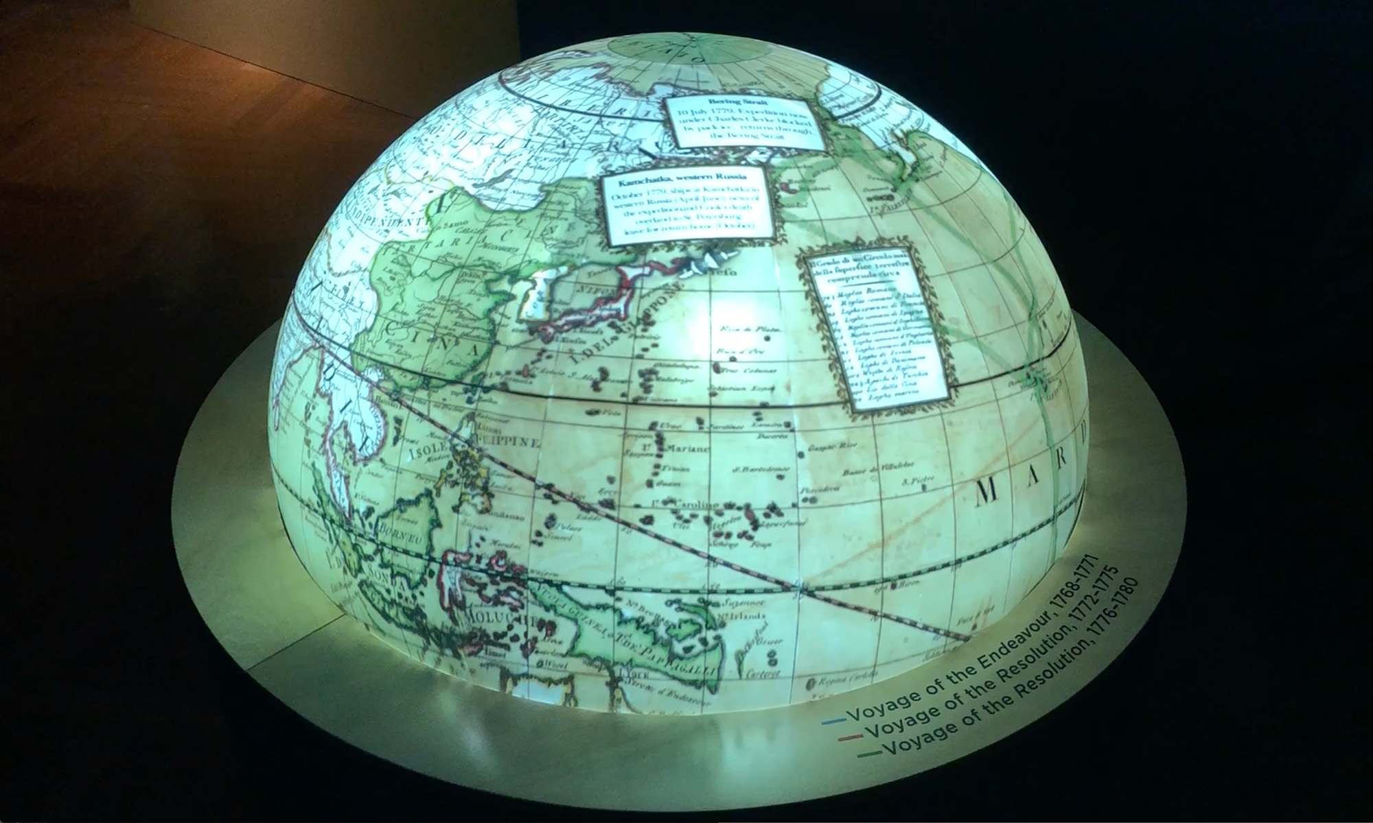
The design of a circular compass room in the centre of the exhibition space, houses an animated projection hemisphere. On the globe Cook’s three voyages are mapped with information pop-ups at various significant moments of Cook’s journeys. This device is centrally placed in the exhibition but not immediately revealed to the visitor so it has an element of surprise. Even though this room is small, it is a thoroughly immersive experience that provides a calm reflective space in the middle of a quite dense exhibition.
The compass space allows you to traverse through different areas of the exhibition and provides the visitor with a strong sense of the scale and magnitude of these early global journeys. A gentle soundscape that references the sea provides a background sound texture in this space.
Project partners included Mental Media.

